In this article, I'm going to briefly explain what is CSS and some basic concepts of CSS such as CSS property.
what is CSS ?
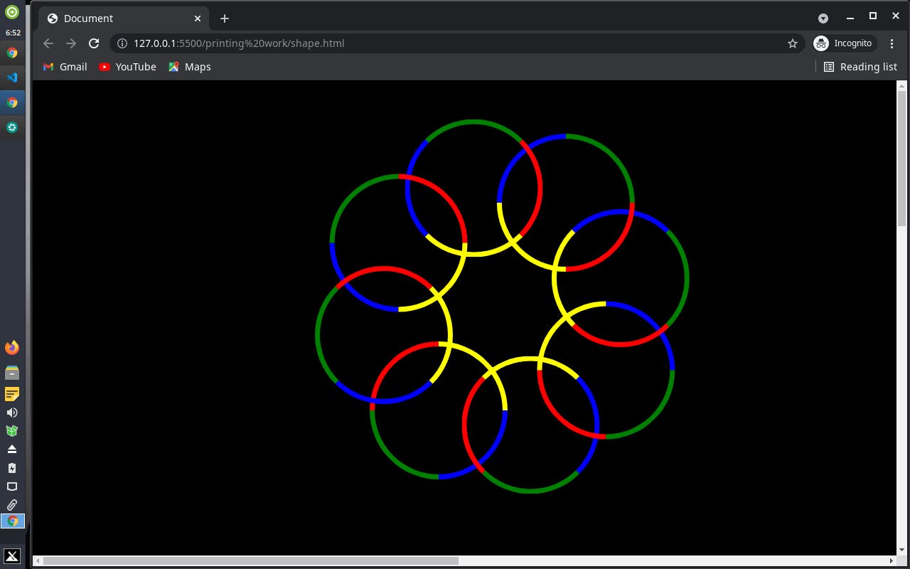
CSS is the cascading stylesheet used to style an Html document. CSS describes how Html elements should be displayed. Below are some of the CSS properties I used in creating my Olympic rings;
-Background color
-border
-Border radius
-Transform
-Position
Let's get started!
First, make sure that your stylesheet file (.css) is properly linked to your HTML page. create a div tag giving it a class. you can name your class as you wish. I used shape to name my class. Next thing is to create our ring we can start by drawing a square.
1) Draw a square
background-color: black;
}
.shape{
position: absolute;
top: 30%;
left: 30%
width:180px;
height:180%;
transform: translate(-10%,30%);
border: 7px solid white;
}
From the code above you can find some of the CSS properties mentioned earlier. well I'm going to explain what they are and their use as CSS is concerned
A)Background-color : This property sets the background color of an Html element. For example, in my code, I gave my element a background color of black. The background of an element is the total size of the element including padding and border.
B)Border: This border property is the shorthand property for ;
-Border-width
-Border-style
-Border-color
From the code above we have a border of 7px solid white.
C)Position: The position property specifies the type of positioning method used for an element. we have various types of positions in CSS such as; Static, Absolute, Relative, Fixed, or Sticky.
D)Transform: The transform property allows you to move, rotate, scale, and skew elements.With the CSS transform property, you can use the following transform methods;
-Translate
-Rotate
-Scale
-Scale x()
-Scale y()
-Skew
-Skew x()
-Skew y()
The translate method moves an element from its current position (according to the parameters given for the x-axis and the y-axis). The code above used -10% for the x-axis and 30% for the y-axis as my parameters.
This will be the output;

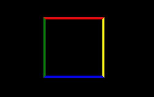
2)As we know square has four borders we can color each of them differently
.shape{
border-top: 7px solid red;
border-bottom: 7px solid blue;
border-right: 7px solid yellow;
border-left: 7px solid green;
}
The output;
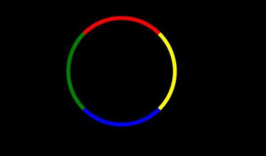
3) Transform it into a circle
{
border-radius: 50%;
}
From the above code, there is a CSS property known as border radius with a parameter of 50%. The border radius property defines the radius of the element's corners. This property allows you to add rounded corners to elements.
The output ;
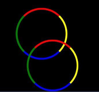
4) Add another div tag inside the previous one you might not see the second circle because the position is absolute, they will overlap.
<div class="shape">
<div class="shape">
</div>
</div>
You will get something like this ;
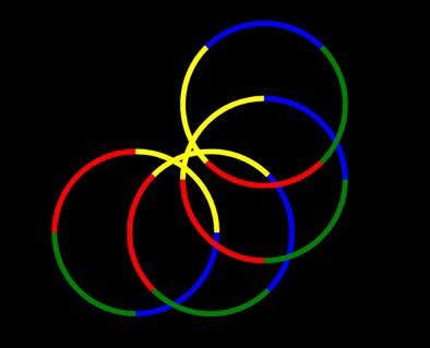
5) Now you can have more divs. We want a circular kind of shape we will rotate the shape
<div class="shape">
<div class="shape">
<div class="shape">
<div class="shape">
</div>
</div>
</div>
</div>
.shape{
transform rotate(-45deg);
}
The rotate method above rotates an element clockwise or counter clockwise according to a given degree.From the code above we have a -45deg making the element to rotate counter clockwise.while positive values makes the element to rotate clockwise.
The output;
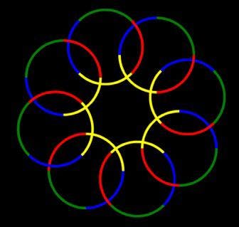
6) Adding more div tags, change the value of the left so that it doesn't look much congested, and also change the top value in case it goes out of the screen.
<div class="shape">
<div class="shape">
<div class="shape">
<div class="shape">
<div class="shape">
<div class="shape">
<div class="shape">
<div class="shape">
</div>
</div>
</div>
</div>
</div>
</div>
</div>
</div>
body{
background-color: black;
}
.shape{
position: absolute;
top: 55%;
left: 39%
width:180px;
height:180%;
transform: translate(-10%,30%);

}
Coding is art, anyone could be an artist.