Creating a crescent moon with pure CSS.

I'm a developer from Cameroon. currently learning javascript.
I started learning CSS arts a few days ago and decided to create a crescent moon for a better understanding. This is a very simple CSS art anyone can hop in.
Getting started...
we start by setting up our HTML boilerplate and correctly linking our stylesheet at the level of the head tag.
<!DOCTYPE html>
<html lang="en">
<head>
    <meta charset="UTF-8">
    <meta http-equiv="X-UA-Compatible" content="IE=edge">
    <meta name="viewport" content="width=device-width, initial-scale=1.0">
    <title>Crescent Moon</title>
  <link rel="stylesheet" href="style.css">
</head>
At the body tag, we add a div with a class of "moon", you could use any name but make sure it's simple and related to what you are actually creating to avoid confusion.
<body>
   <div class="moon"></div>
</body>
Moving to the CSS file to add some styling to our Html page. we begin by styling the body of our HTML page.
body{
    background-color: black;
}
Set up the background to black for a clearer view you could use any color, it depends on you.
Next is to style the div ;
.moon{
    margin: auto;
    position: absolute;
    top: 0;
    right: 0;
    bottom: 0;
    left: 0;
    width: 100px;
    height: 100px;
    background-color: transparent;
    border-radius: 50%;
    box-shadow: 25px 10px 0px 0px yellow;
  }
Explanation of the above code snippet:
1.Margin:
The CSS margin properties are used to create space around elements, outside of any defined borders. From the above code snippet, we set the margin to "auto" to horizontally center the element within its container.
2. Top, Right, Bottom and Left:
For absolutely positioned elements, the top, right, bottom, and left properties specify offsets from the edge of the element's containing block(what the element is positioned relative to).
3.Height and Width:
The CSS height and width properties are used to set the height and width of an element. From the above code snippet, we set the height and width to 100px.
4.Border-Radius:
The border-radius property defines the radius of an element's corners. Tip: This property allows you to add rounded corners to elements! From the code snippet, the border-radius is set up to 50%.
5)Box-Shadow:
The box-shadow property adds shadow effects around an element's frame. You can set multiple effects separated by commas. A box-shadow is described by X and Y offsets relative to the element, blur and spread radius, and color.
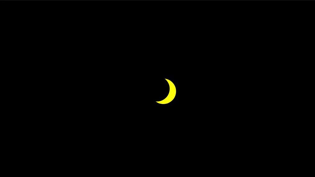
The end product
We've come to the end of this article, hope you find it interesting. Thanks for reading.


